08 / Case Study · ~3 min read
The Robbins Company
Brand identity for the world's foremost developer of underground excavation machinery. 70-year-old global industrial leader. Equipment used on more than 1,000 tunneling projects worldwide.

The Challenge
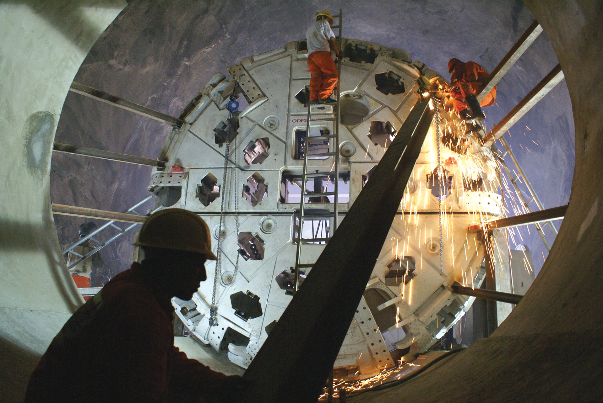
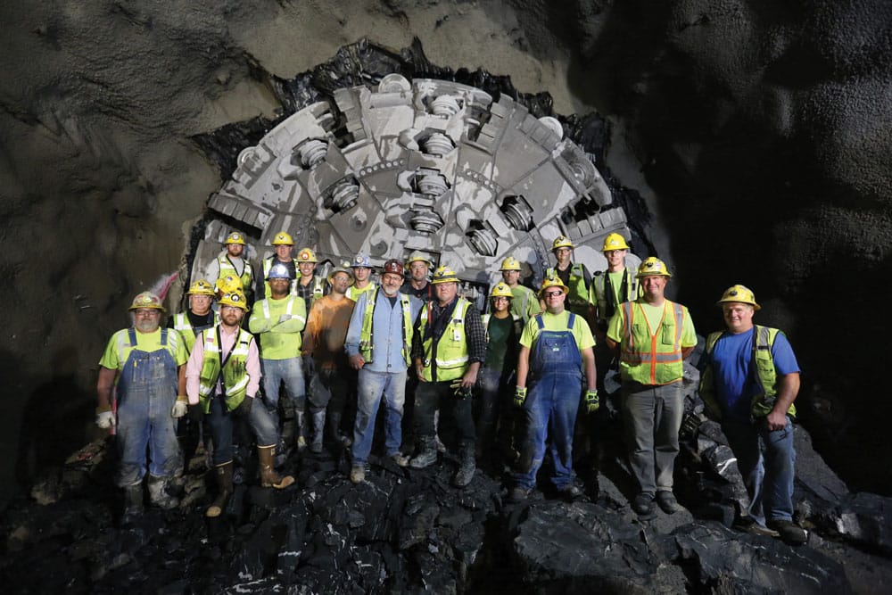
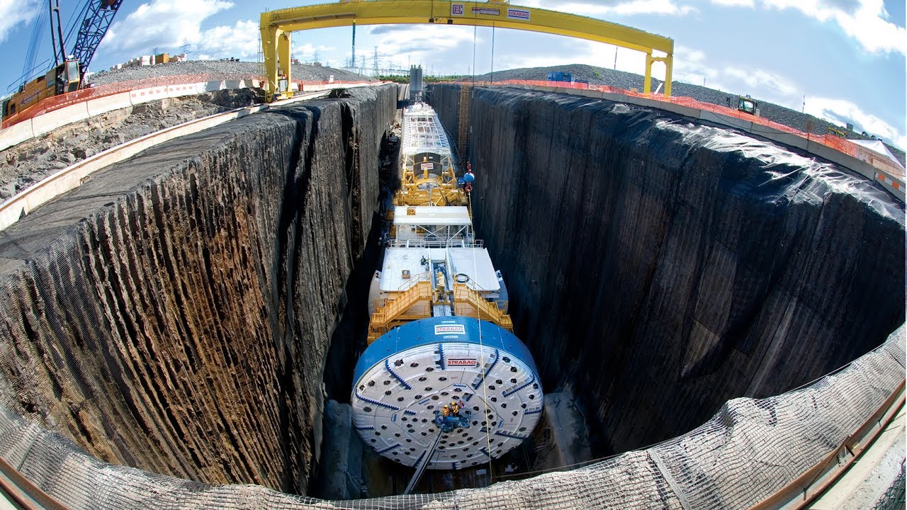
The Robbins Company has spent nearly seven decades building the machinery that moves the world underground. Tunnel-boring equipment used on more than a thousand projects across road, rail, water, and mining infrastructure globally.
The brand needed an identity equal to the engineering. Serious. Modern. Grounded in industrial reality without falling into the visual clichés of B2B industrial marketing.
Approach
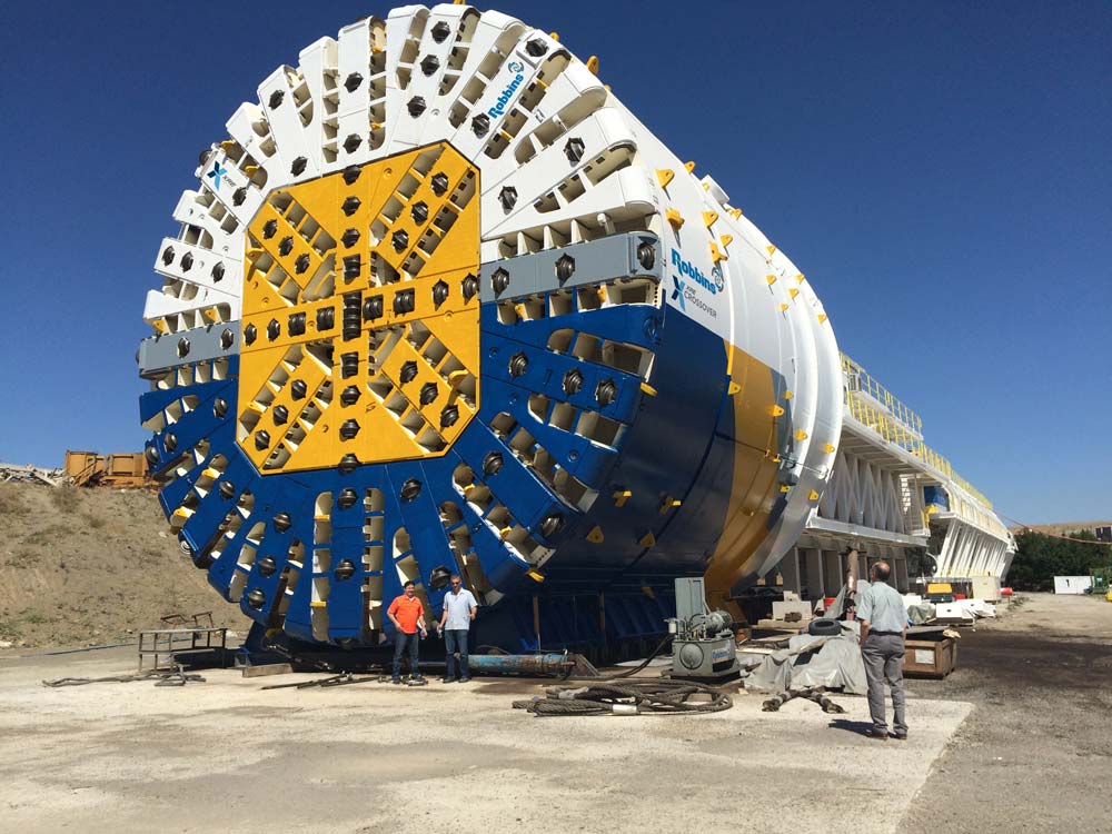
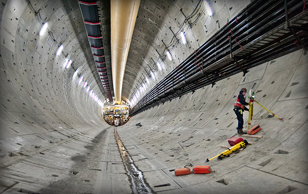
Brand identity work spanning logo system, applications, and visual language for B2B industrial context. The identity needed to read as confident in any of the markets Robbins serves, from a 13m-diameter road tunnel through mixed ground to a 600mm-diameter utility line in abrasive hard rock. Without picking a single sector aesthetic.
The Work
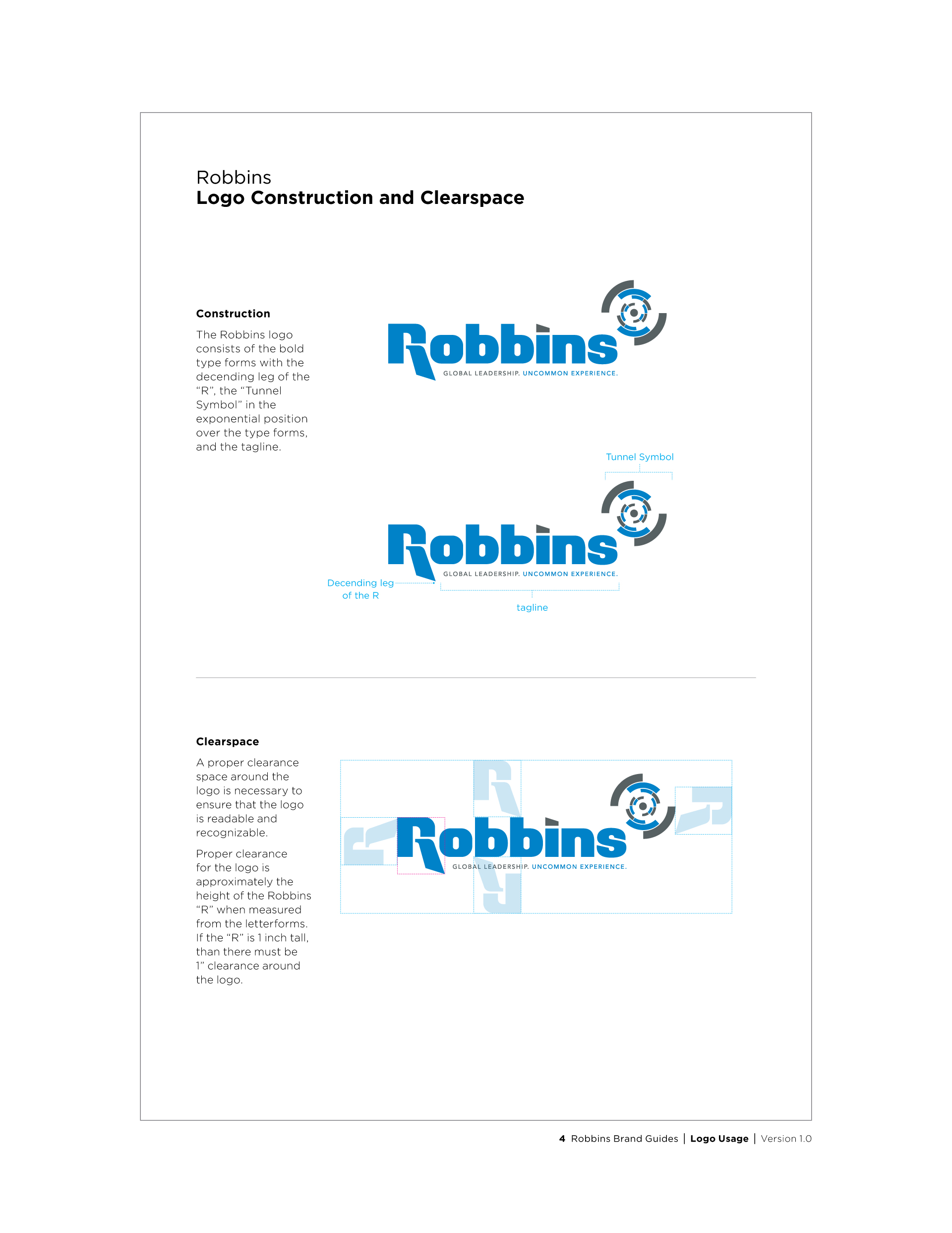
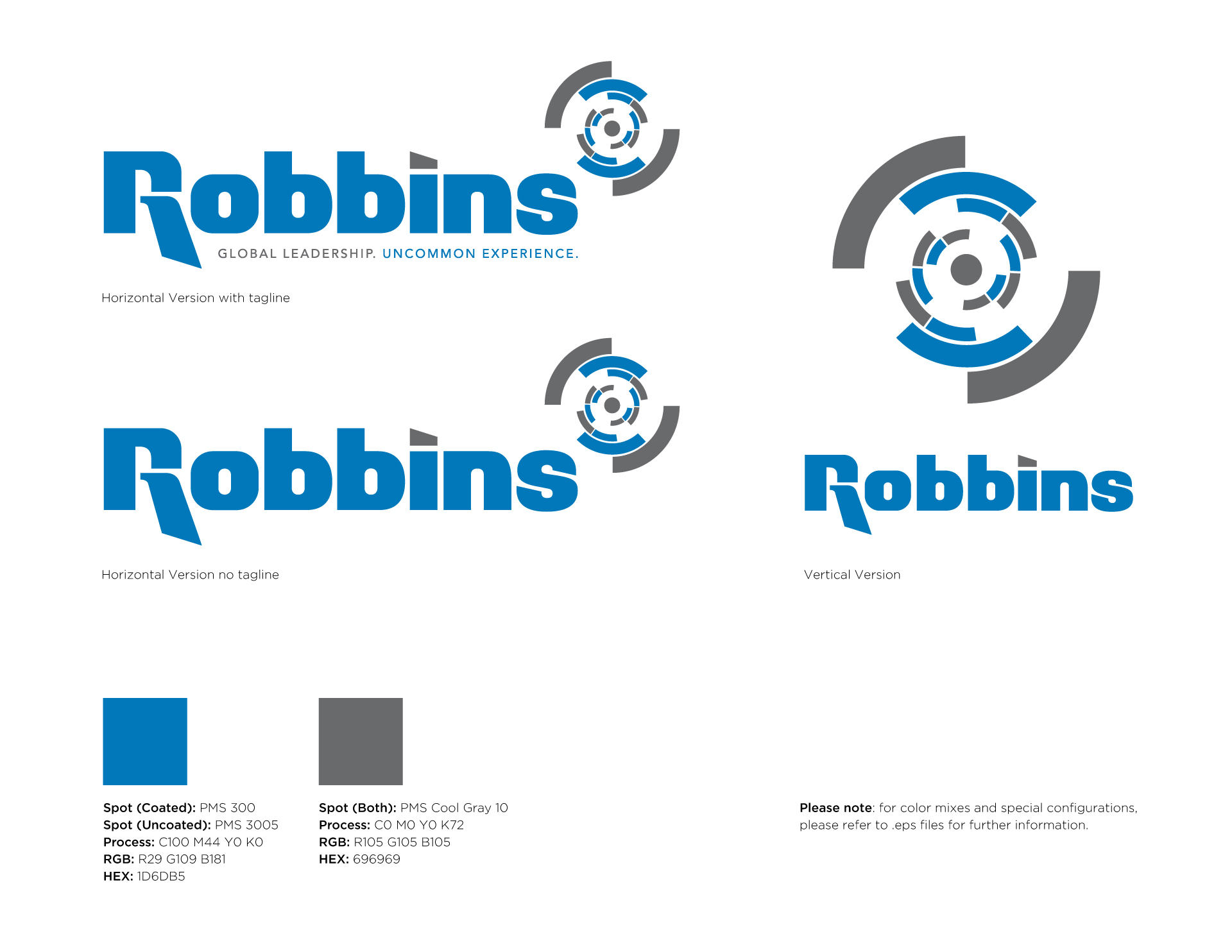
Brand mark, logo system, color and typography, industrial applications. The identity work was paired with brand voice and positioning that read as engineering authority instead of industrial generic.
Reach
The identity scaled across the company’s global operations. Site signage, equipment livery, corporate communications, technical documentation. In active use across more than a thousand tunnel-boring projects worldwide.
Reflections
Industrial B2B brand work rewards designers who treat seriousness as a craft choice instead of a default. Robbins competes globally on engineering reputation. The identity had to support that. It had to make the engineering reputation feel earned at every visual touchpoint, instead of undercutting it with a brand that reads smaller than the company actually is.
Credits
Role. Creative Director through James Nesbitt Design LLC.
Output. Brand identity, logo system, applications across industrial contexts.